Client:
Client:
Green Earth
Green Earth
Green Earth
UI UX Design | Product Design
Client
Client
Green Earth
Green Earth
Year
Year
2024
2024
Time Frame
Time Frame
2 Weeks
2 Weeks
Scope of Work
Scope of Work
UI UX Design | Product Design
UI UX Design |
Product Design
Utilized
Figma
Figma
Designed an online platform that reflects Green Earth’s values whilst delivering an intuitive shopping experience. I utilised tools such as Figma and used various research methods and design principles to create a comfortable and pleasing user experience.
Designed an online platform that reflects Green Earth’s values whilst delivering an intuitive shopping experience. I utilised tools such as Figma and used various research methods and design principles to create a comfortable and pleasing user experience.
Designed an online platform that reflects Green Earth’s values whilst delivering an intuitive shopping experience. I utilised tools such as Figma and used various research methods and design principles to create a comfortable and pleasing user experience.


Overview
About Green Earth
Green Earth is a sustainable fashion brand targeting eco-conscious young consumers, emphasising ethical practices and minimalist design. It caters primarily to Gen Z and Millennials who value sustainability and seek to make a positive impact through their clothing choices. The brand promotes "conscious fashion for a better planet" and prioritises organic materials and a natural aesthetic.
The challenge is to create a user-friendly online shopping experience that effectively communicates the brand's commitment to ethical fashion and sustainability. The website should showcase products while highlighting the brand's values and mission. Key areas of focus include user experience, visual design, navigation, and communication of Green Earth's dedication to conscious fashion.
A sustainable fashion brand catering to eco-conscious consumers.
Commitment to ethical practices and minimalistic design.
Primarily targets Gen Z and Millennials with a focus on conscious consumption.
Promotes "conscious fashion for a better planet".
Creating a seamless online shopping experience that aligns with brand values.
Challenges and Problems
This project tackles creating an online store for Green Earth, a sustainable brand appealing to conscious consumers. Challenges include engaging young audiences who prioritise both style and environmental values. The website must seamlessly blend minimalist design with sustainability, effectively narrating the brand's ethos. Balancing organic aesthetics with modern functionality is key. The messaging emphasises fashion's role in positive change and guides users toward informed, sustainable choices.
Solution
Through strategic design thinking, I aim to overcome these challenges by focusing on human centred UI/UX design in order to bring Green Earth's vision to life, catering to a community of conscious consumers dedicated to making a positive impact with their clothing choices.
By adopting a comprehensive, human-focused approach, this will aim to also improve on conversion rates and impact of the co friendly brand.
Mood Boarding
Typeface & Fonts
I chose to look for a variable typeface that has a variety of fonts so that a type scale can be made in the future when creating a design system. I chose a chunky google typeface “Anybody” which will only be used for the Logo and not the website. This is because I wanted a more reader friendly typeface for the website so that text can be read easily. The typeface for the website, I chose “Poppins”. This is because it looks very minimal, geometric and clean and again has many variable font styles. When choosing the typeface I thought a lot about the brief mentioning the brand image being simple and minimalist design style. The sans-serif font as well as the characteristics of the typeface also allows for optimising the website’s accessibility by keeping the typography highly readable as well as being attention grabbing for readers. I tried different letter spacings, settling on 2% - 4% depending on the weight and size of the font and whether it would be used as a heading, body text, caption, link, button etc. I chose to use one main variable typeface with varying fonts from the same typeface family for the website to allow for consistency. I displayed an example of how the text would look using certain fonts styles from the Poppins typeface family for the different elements of heading, title, body text etc.
Colour
I also chose to stick to 3 main colours using the 60 - 30 - 10 rule. A primary, secondary and accent. The colours used are already found in nature. The psychology behind the green represents growth, nature, equilibrium, positivity and stability. The off white with a tint of earthy ochre represents warmth and optimism and being off white represents that bit of balance and calm. The muted pink represents sensitivity, love, care and respect. These three colours work together to give off the impression of a sustainable eco conscious brand with the tagline in mind "conscious fashion for a better planet". My colour palette resembles a muted version of a split complementary colour harmony. I chose to use the accent colour for the CTA buttons/links. I did not design the colour palette with dark mode in mind as I do not think it would have conveyed the image the brand wants in dark mode. When printed on tags, paper assets etc, the muted tones again shouldn't take much ink and recycled paper can be used, this will lower the footprint of the business.
Imagery
I chose images that convey the style of clothing pictures where the background is muted and styles of background/hero images. Along with element styles that can be used that have organic shapes and use of colours from the palette.
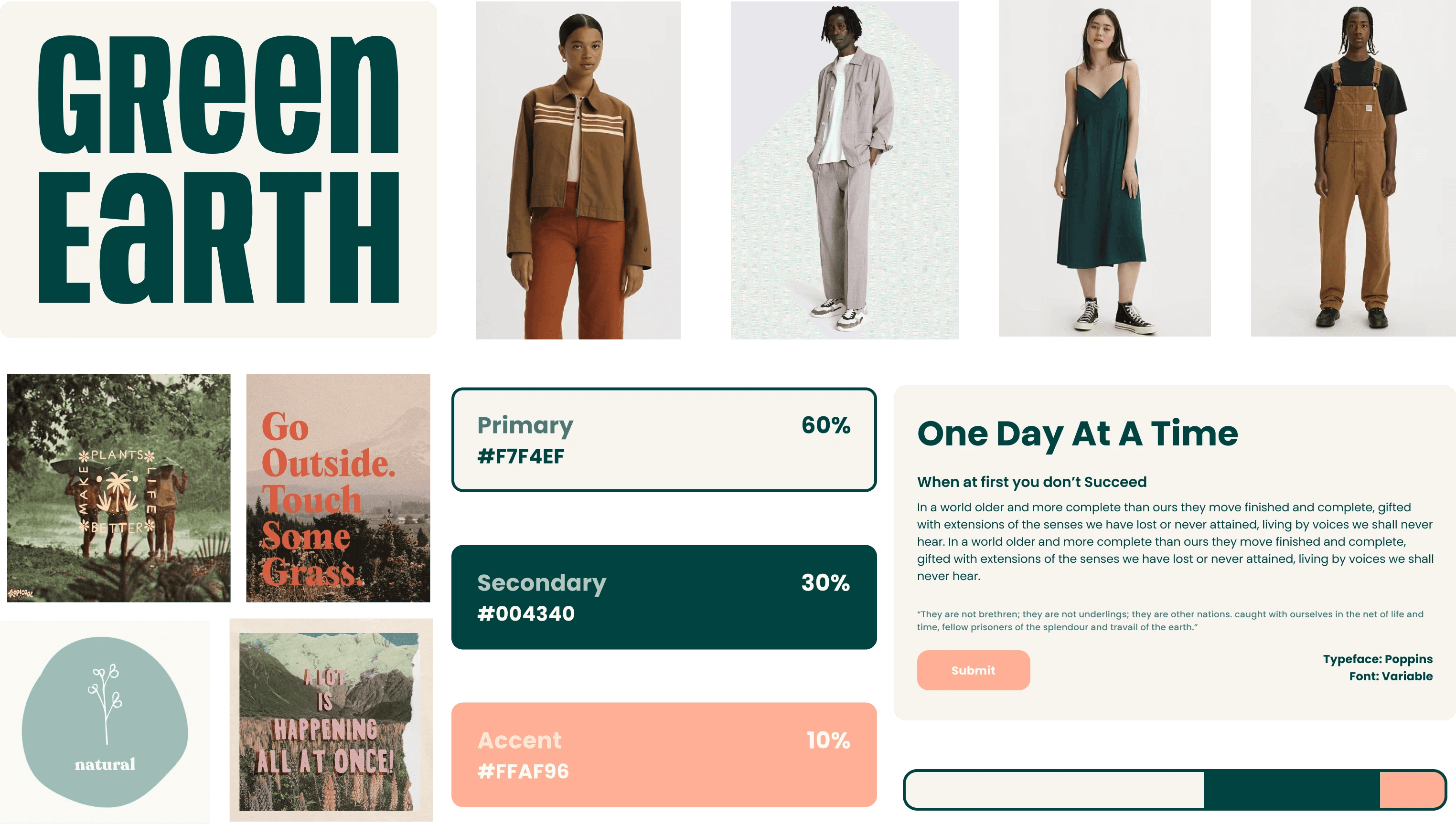
Green Earth - Mood Board

Green Earth - Mood Board

Green Earth - Mood Board
User Flow & Information Architecture
User Flow
The user flow is guided by a rational and logical progression, starting with an engaging landing page that communicates the brand's commitment to sustainability. Users are then intuitively led through the shopping journey, with a clear pathway to explore product categories, view detailed information about each item, and make informed and conscious choices. The process is streamlined for efficiency, reflecting the brand's minimalist design philosophy.
Information Architecture
The Information Architecture (IA) has been meticulously designed to create a seamless and intuitive user experience. The IA prioritises clarity and logical organisation, ensuring that users can easily navigate through the content and understand the hierarchy of information. Key elements such as sustainable clothing categories, product details, and the brand's ethos are strategically structured for optimal accessibility.
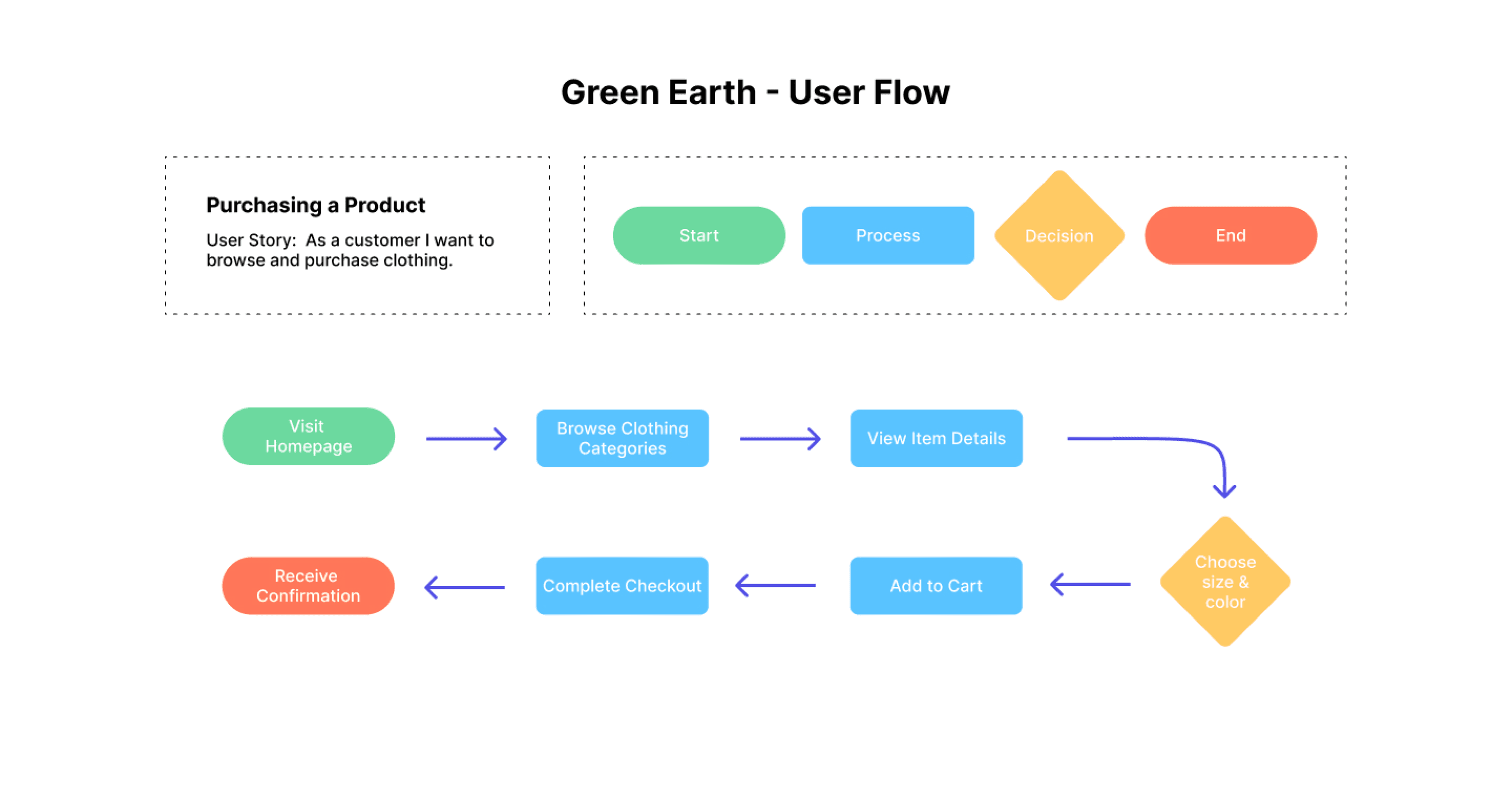
Green Earth - User Flow Diagram

Green Earth - User Flow Diagram

Green Earth - User Flow Diagram
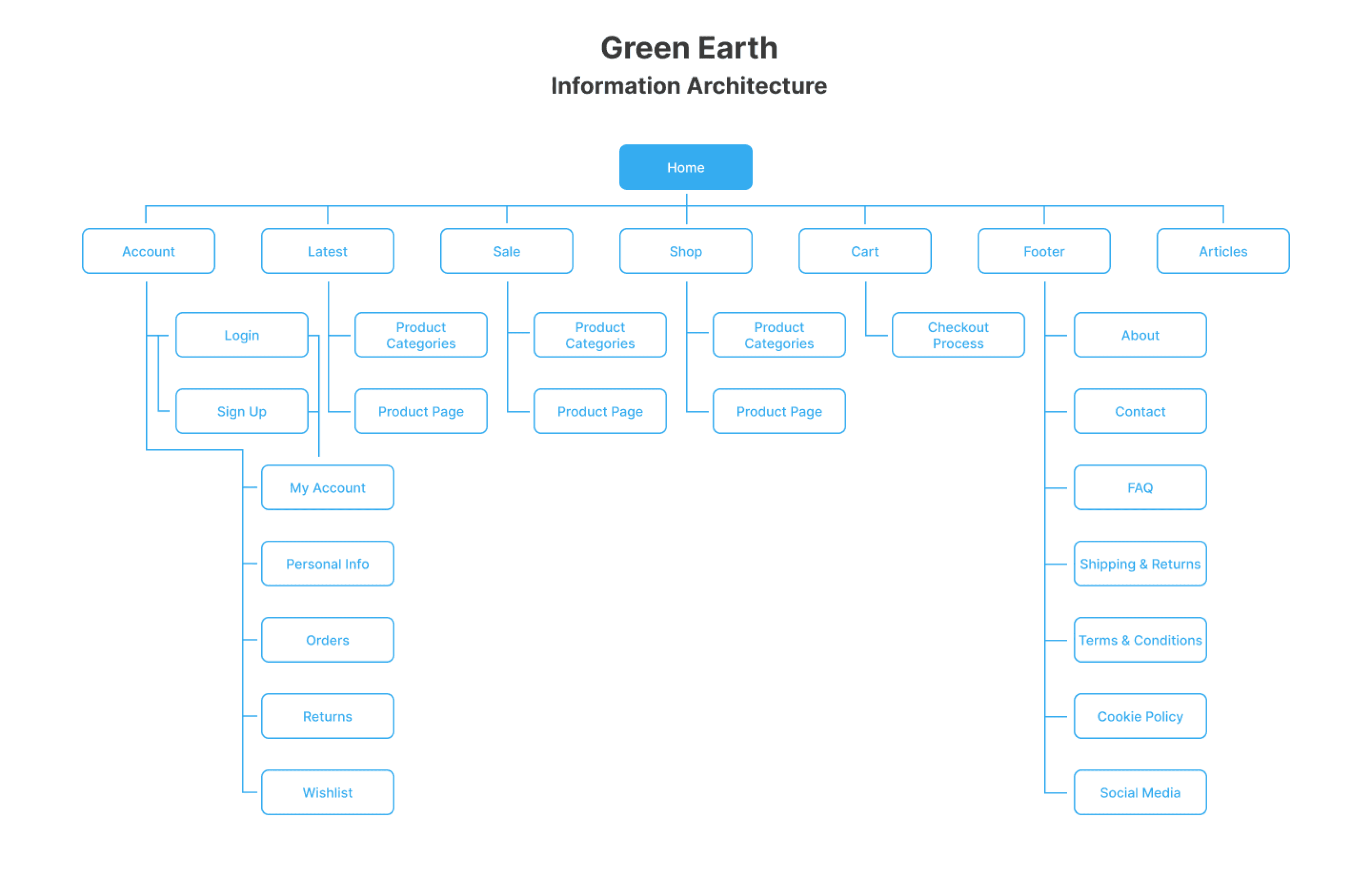
Green Earth - Information Architecture Diagram

Green Earth - Information Architecture Diagram

Green Earth - Information Architecture Diagram
Wire Frames
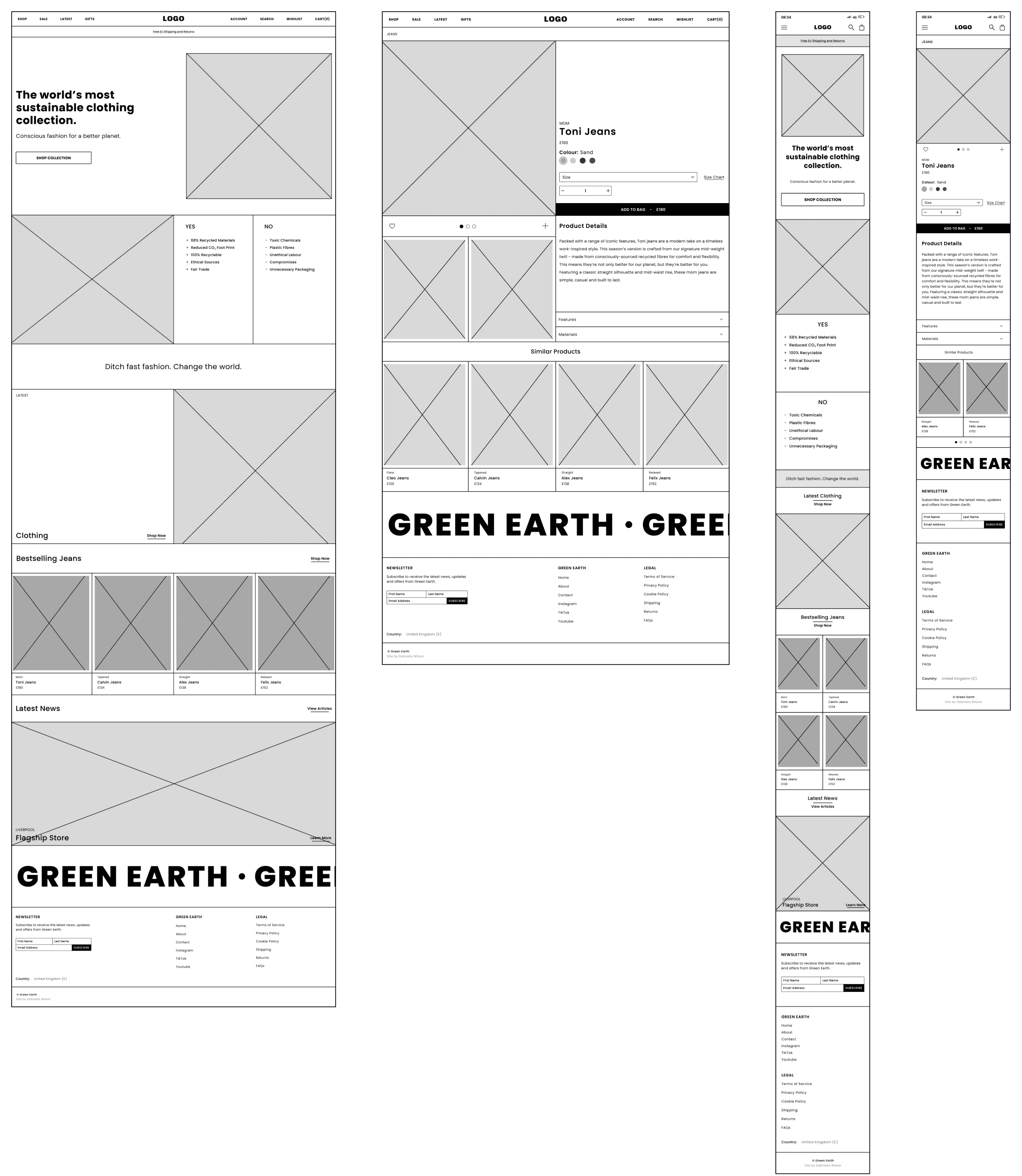
The mid-high fidelity wireframes showcase a user flow guided by rational and logical considerations. The foundational design choices for the wireframe were rooted in the core principles of Hierarchy, Whitespace and Alignment.
By establishing a clear hierarchy, I've organised information in a structured manner, allowing users to grasp the importance of different elements on the interface. This intentional arrangement helps direct attention to key features and content, facilitating a seamless user experience. Through the strategic use of font sizes, colours, and placement, I've created a visual roadmap that signifies the relative importance of various elements. This hierarchy not only enhances the overall readability of the interface but also contributes to a more user-centric design where users can effortlessly engage with and understand the content based on its significance within the context of the overall design.
I've purposefully integrated whitespace as a key element to elevate the overall user experience. This intentional use of space serves to create visual clarity and breathing room, allowing users to navigate the interface seamlessly. By strategically incorporating whitespace around text, images, and interactive elements, I've prevented visual clutter, contributing to a clean and organised layout. Whitespace plays a crucial role in emphasising important elements and enhancing the hierarchy and readability of content. It naturally separates different sections, guiding users through the interface in a cohesive manner. This conscious utilisation of whitespace not only ensures a more aesthetically pleasing design but also fosters a user-friendly experience, where individuals can focus on essential information without feeling overwhelmed by unnecessary visual distractions.
In my design, text alignment serves as a crucial element contributing to a clean and organised presentation. By carefully aligning text elements, I've established a sense of visual order and coherence throughout the interface. The strategic use of text alignment enhances readability and comprehension, ensuring that users can easily follow the flow of information. Consistent alignment provides a polished and professional appearance, contributing to a visually pleasing design.
Mid Fidelity Wireframes - Landing & Product Page

Mid Fidelity Wireframes - Landing & Product Page

Mid Fidelity Wireframes - Landing & Product Page
The Design System
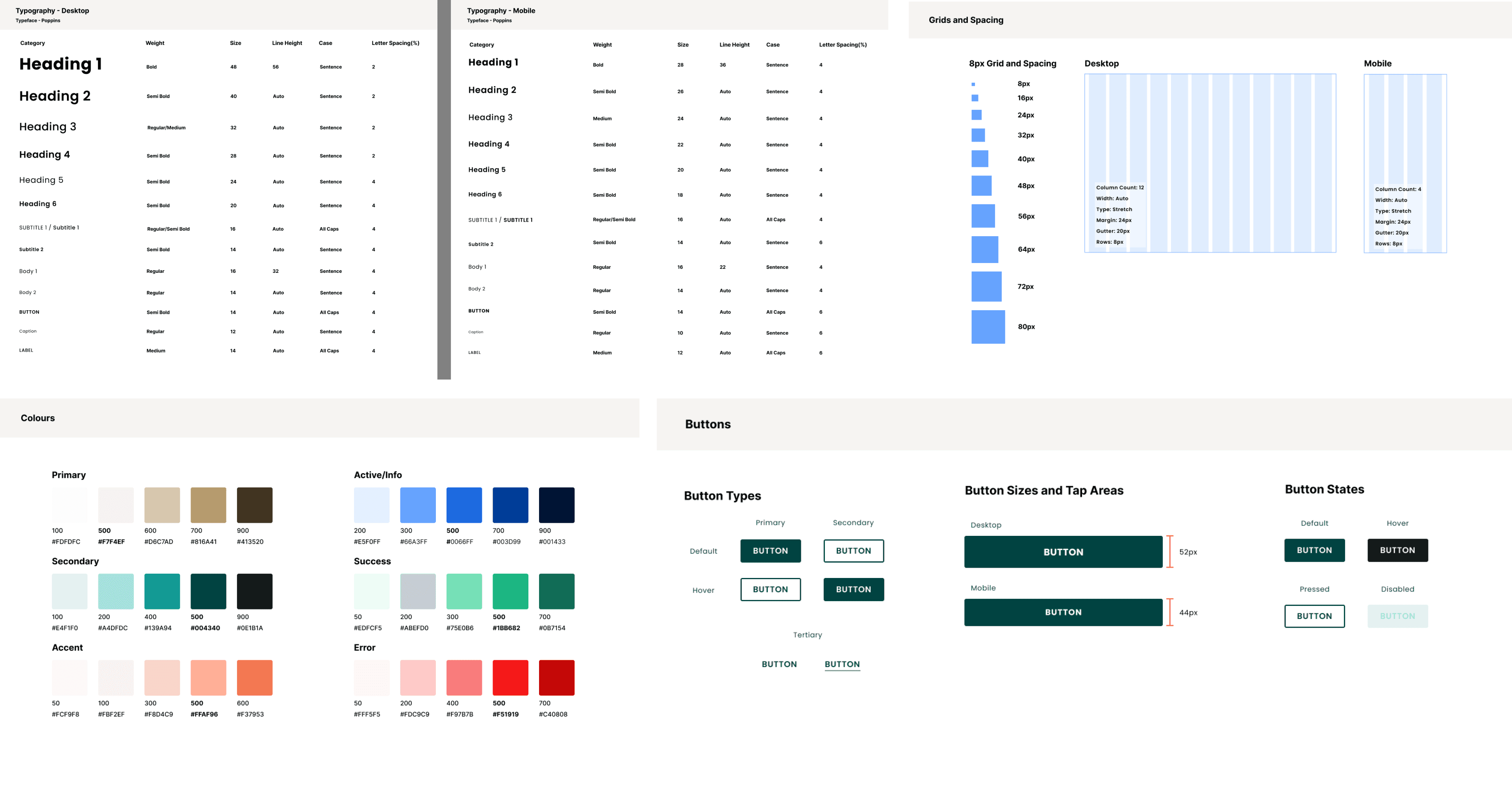
The design system serves as a cohesive framework, providing consistency and a unified visual language across the entire website. It encompasses a harmonious blend of sustainable brand elements, such as earthy aesthetics and minimalist design principles, ensuring a seamless and recognisable user experience. From colour palettes to typography choices, the design system establishes guidelines that reflect the brand's identity and resonate with the target audience. This systematic approach not only streamlines the design process but also facilitates scalability and future iterations. By adhering to the principles laid out in the design system, the project achieves a holistic and aesthetically pleasing representation of Green Earth
The typography is carefully selected to align with the brand's minimalist design philosophy. Clean and readable fonts with a modern flair are chosen to convey a sense of simplicity and sophistication. This ensures that the content is easily digestible while maintaining a contemporary aesthetic. I made a type scale for both desktop and mobile devices.
The colour palette for the design system embodies the natural and earthy aesthetic of Green Earth. Dominated by soothing tones such as organic greens, calming neutrals, and warming pink coral, the colours are chosen to evoke a sense of sustainability and connection to the environment. I also added active, success and error palette colours.
I chose an 8px grid system as this serves as the backbone of the design, ensuring consistency and precision in layout. This modular grid provides a framework for organising elements, maintaining even spacing, and creating a visually balanced composition. The 8px grid contributes to a cohesive and structured design, aligning with the brand's commitment to minimalist aesthetics. I made grid layouts for both desktop and mobile.
Design System

Design System

Design System
Landing & Product Page
Landing Page
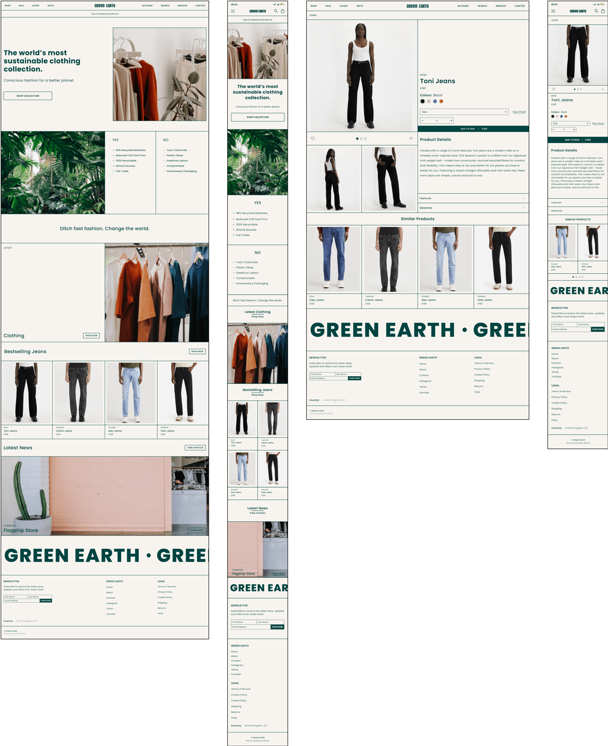
The landing page is a captivating and purposeful introduction to the brand's commitment to sustainable and conscious fashion. The design welcomes users with a visually striking layout that seamlessly integrates the natural and earthy aesthetics of the brand.
The landing page begins with a compelling hero section that features high-quality visuals of sustainable clothing in natural environments. These images not only showcase the products but also immediately communicate the brand's connection to the environment.
A clean and intuitive navigation menu is strategically placed, allowing users to explore key sections effortlessly. Categories such as 'Men,' 'Women,' and 'Collections' are prominently featured, providing a clear pathway for users to delve into specific areas of interest.
Striking a balance between aesthetics and functionality, the landing page showcases featured products or collections. This section may incorporate visually appealing images, brief product descriptions, and compelling calls-to-action, encouraging users to explore further.
The landing page is rounded off with a clean and informative footer that includes essential links, contact information, and links to the brand's social media. This ensures comprehensive navigation and connectivity for users.
Green Earth's landing page is a captivating blend of visuals, messaging, and functionality, offering visitors a compelling entry point into the world of sustainable and conscious fashion.
Product Page
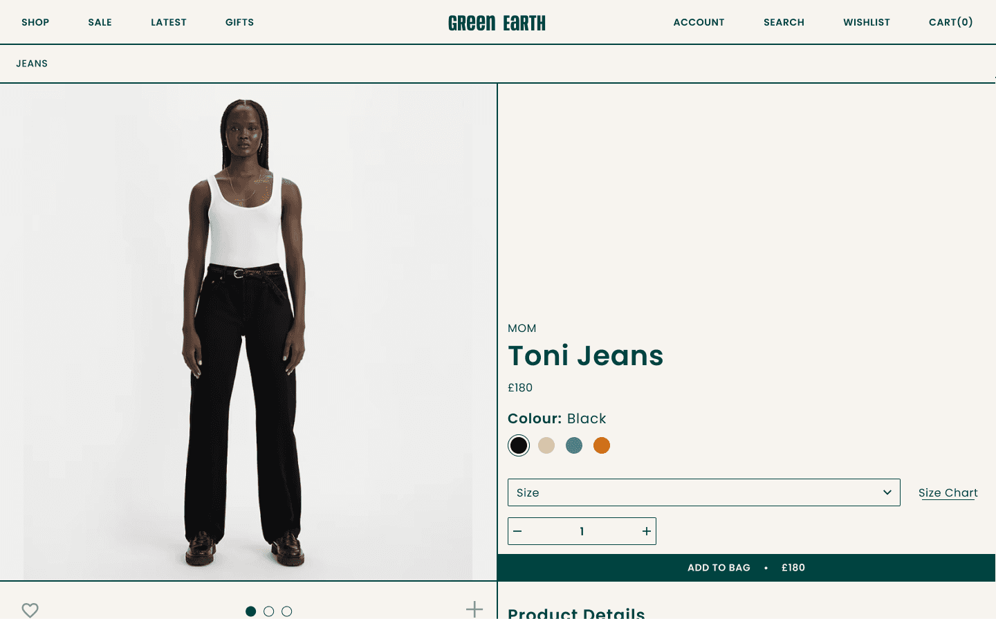
The product page maintains the brand's aesthetic continuity with a clean and unobtrusive header. Here, users can find navigation options to return to the main site or explore related categories. A clear call-to-action allows users to add items to their cart, maintaining a seamless shopping experience.
The core of the product page is dedicated to showcasing the sustainable clothing items. High-quality images take center stage, allowing users to view products from various angles. A minimalist design approach ensures that the focus remains on the details of the clothing, highlighting the organic materials and earthy textures.
Beneath the product images, a concise yet comprehensive section provides essential details. This includes information on materials, sizing, and care instructions. Transparent details about the product's eco-friendly attributes align with Green Earth's commitment to conscious fashion.
Strategically placed call-to-action buttons guide users to effortlessly add items to their cart or proceed to checkout. Clear pricing and purchase options, such as color or size variations, are presented in an easily navigable format, ensuring a smooth and intuitive user flow.
To encourage further exploration, a section featuring related products or collections is included. This not only enhances the user experience by offering curated suggestions but also promotes cross-selling and increased engagement. Additionally, an "add to wishlist" feature enhances the shopping experience, enabling users to curate their selections.
Landing Page and Product Page

Landing Page and Product Page

Landing Page and Product Page
Reflection & Closing Thoughts
Reflection
The journey of designing Green Earth's website presented a unique blend of challenges and creative opportunities. Navigating the delicate balance between sustainability, aesthetic appeal, and user experience required a thoughtful approach. The integration of eco-friendly design principles and a minimalist aesthetic became a cornerstone in crafting a digital space that resonates with the conscious consumer.
Addressing challenges such as communicating the brand's ethos through design elements, creating an intuitive user flow, and incorporating sustainable technologies underscored the complexity of the project.
Factors like colour palette, typography, buttons, and the 8px grid within the design system played a pivotal role in maintaining consistency and coherence. Each design element was a deliberate choice aimed at reinforcing Green Earth's commitment to conscious fashion.
Closing Thoughts
The case study encapsulates the transformative journey of bringing Green Earth's sustainable fashion vision to life in the digital realm. The design solutions presented here strive to create an immersive experience that not only showcases products but also educates and inspires users to make environmentally conscious choices.
The landing page serves as an inviting gateway, encapsulating the brand's essence, while the product page seamlessly integrates sustainability details into the shopping experience. The design system, with its carefully chosen elements, acts as a guiding force, ensuring a harmonious and recognisable brand presence.
As the digital space for Green Earth evolves, the case study provides a foundation for ongoing refinement and innovation. It reflects not just a design process but a commitment to a better planet—one where conscious fashion becomes a natural and integral part of the consumer's journey.
